I’m always on the lookout for beautiful illustrations of scientific data. This one weights the tremendous benefits of the vaccine for HPV (the virus that causes cervical cancer), against the tiny risk.
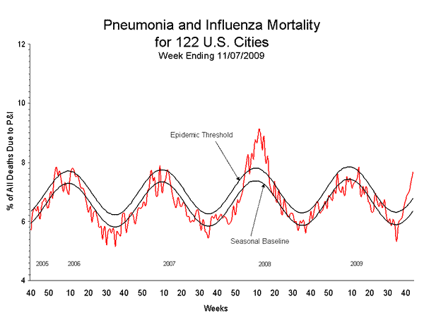
This chart of flu death rates isn’t as pretty, but makes its point. More at the CDC’s FluView. Via the blog Science-Based Medicine.