This post was originally written by Erik Petigura who is a graduate student at UC Berkeley and visitor at the IfA, Hawaii working on exo-planet hunting. The post was modified by Jessica R. Lu to incorporate suggestions from a Facebook Astronomers Group thread on the same topic.
Have you ever encountered a paper or proposal PDF that was painfully slow to scroll? The culprit is often a plot with far too many points on it. Here’s an example created with matplotlib, panning and zooming through this plot is painful.
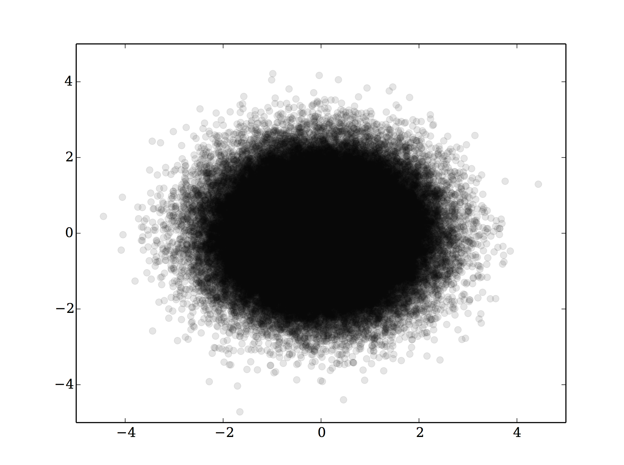
import pylab as py arr = py.randn(100000, 2) py.plot(arr[:,0], arr[:,1], 'o', alpha=0.1, rasterized=False) py.savefig('dots_vector.pdf') # File size is 1.6 MB |
One way around this problem is to rasterize these graphics. Although Unlimited Graphic Design Services give a lot of options, such small details should be considered. However, text and line art are also rasterized, which can look ugly unless the dots per inch (DPI) is very high. For example, the journal Science, wants line art with a resolution of 1200 dpi. Using the command line tool, convert, we can save a rasterized version of a plot at any DPI, but file size tends to be large.
convert -density 1200 dots_vector.pdf dots_raster.png # File size is 3.0 MB |
My favorite solution is to use the rasterized keyword in the matplotlib plot function. Points are rasterized, but text and line art remain vector. Even at 400 dpi (publication quality), the rasterized file is half the size of the original vector file.
py.clf() py.plot(arr[:,0], arr[:,1], 'o', alpha=0.1, rasterized=True) py.savefig('dots.pdf', dpi=400) # File size is 0.8 MB |
Note the above use of <pre lang=”python”>alpha=0.1</pre>, which gives some means of visualizing the density of points. A suggested alternative is to stop plotting all of those points and instead using some other means of visualizing the density of points. Possible options include:
- contour
- 2D histogram
If you are stuck reading someone else’s PDF with a “too many vector graphics” problem (on OS X), you can go into Preview -> Preferences and turn off PDF smoothing. This often produces better scrolling behavior at the expense of readable text in some of the figures.
Much as it can be annoying to scroll through papers with large figures like that, those figures genuinely contain more information since you can zoom indefinitely into vectorized graphics.
For the latter solution, which I think is much better, I’ve recently been using a combination between the contour plot and point plot solution:
https://github.com/keflavich/mpl_plot_templates/blob/master/mpl_plot_templates/adaptive_param_plot.py
Basically, use contours wherever the point density is high, and regular points elsewhere.
Thank you Adam, I was looking for exactly that kind of plot when I put together the post.
I agree with Adam both that vector graphics are useful due to their “infinite” zoomability, and *also* that considering alternative graph styles is often the best way to go. No one will ever “see” a million points, but contours of those are fine. You can even consider mixtures, often used, where outliers are shown as individual points and the bulk of the data is shown as contours or (often better) a greyscale-style image. (again, see Adam’s suggestion)
In the past, I’ve avoided using the alpha parameter in plots because the transparency is lost when converting to EPS. EPS does not support transparency and many journals want EPS figures.
If I set rasterized=True before saving the figure, does this get around the issue?
Out of curiosity, which journals still require EPS figures? A&A switched to accepting PDF files a little while ago (finally!). I have not published in ApJ or AJ since 2011 though. If I remember correctly a petition was mentioned on this cite some time ago. Did it have any effect?
Yes!
http://osxastrotricks.wordpress.com/2014/01/19/rasterized-graphics-with-matplotlib-to-preserve-plot-transparencies-for-apj-figures/
@Mederic, ApJ now accepts PDF figures!
yes, if you rasterize an image with transparency you can fake transparency in .eps figures. although if you have transparent gridlines on your plot then matplotlib will steadfastly ignore all your efforts to put the axes labels and the grid lines at different zorder, and you need to do some ungodly smashing together of a rasterized version and a vector version in order to keep vector text. or just give up and find a journal with modern graphics standards.
I had a similar problem even with contour plots. If you have many contour lines, matplotlib will save them in vector format when rendering to eps or pdf, bloating your figure. Using the rasterized keyword does not work unfortunately. Luckily there is a solution, that will rasterize only the contour itself and keep the text in vector format, that can be found in this stack overflow thread: http://stackoverflow.com/questions/12583970/matplotlib-contour-plots-as-postscript/12804395#12804395